Home   /   Work   

Dashboard . UI design

Smart dashboard design

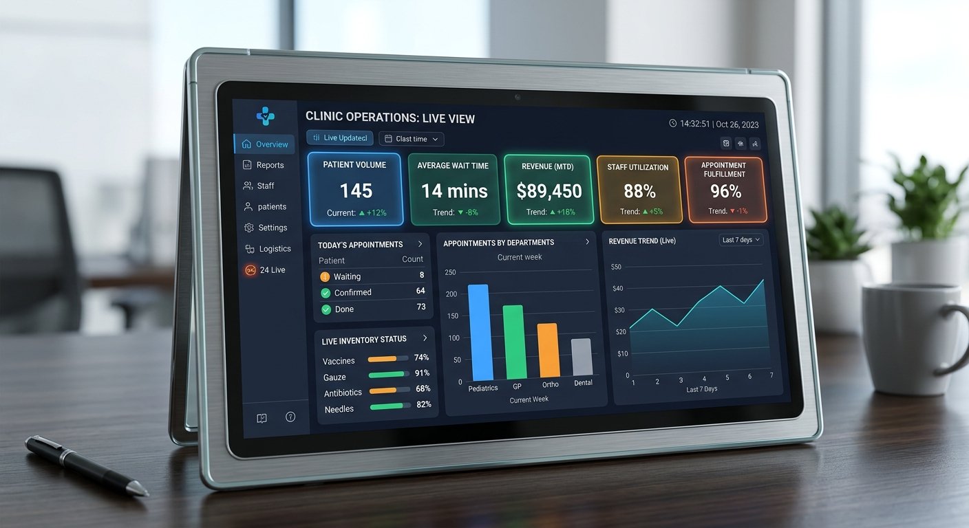
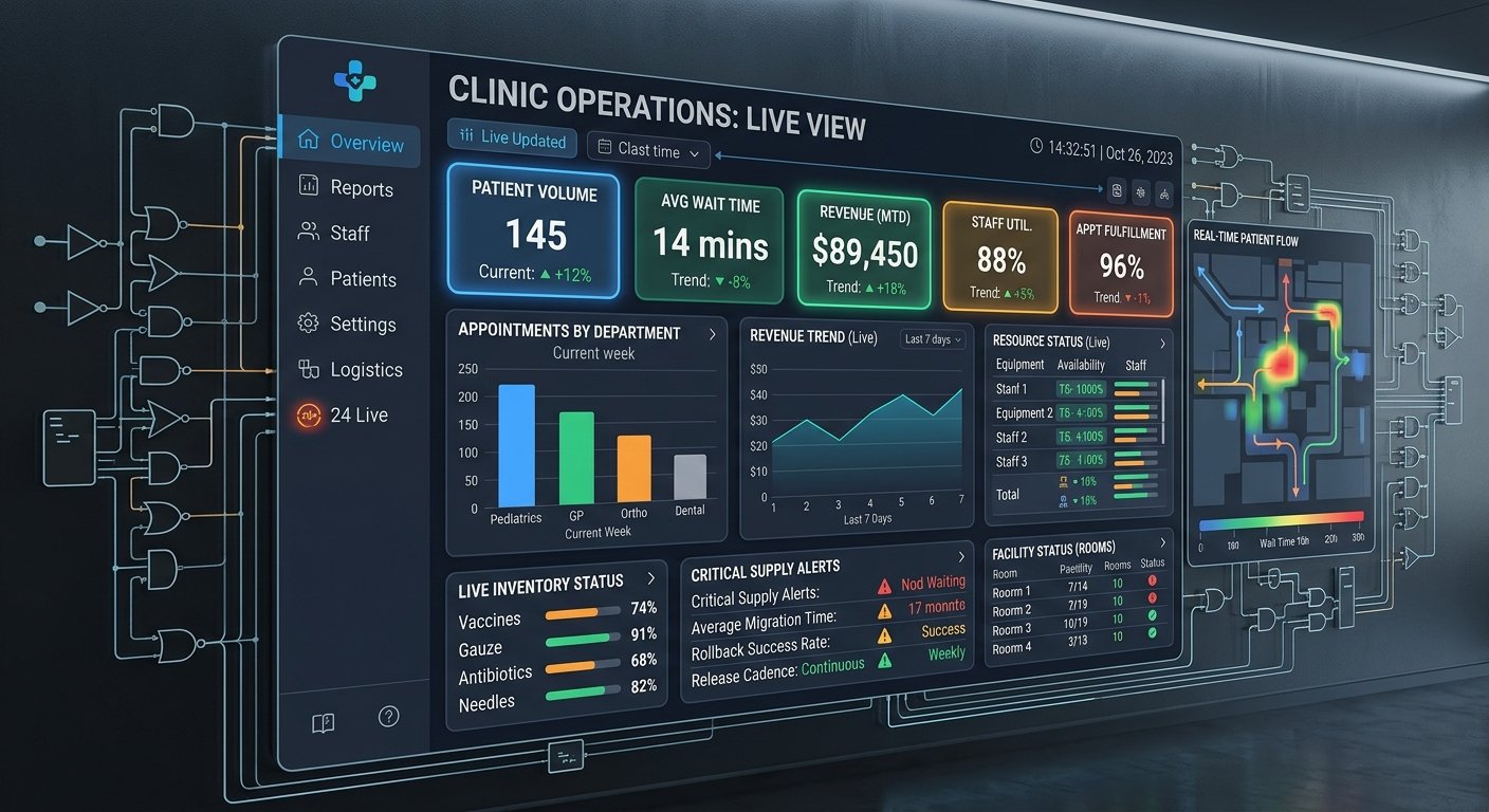
An operations dashboard that turned a dozen weekly spreadsheets into one live view for clinic managers.
Client
Healthcare network
Industry
Services
UX research, Dashboard design, Data integration
Timeline
8 weeks
Dashboard . UI design

Smart dashboard design

The challenge

Managers assembled reports by hand from several systems, so decisions were made on week-old data. Existing BI views were built for analysts, not operations.

Our approach

Step 1

Workshops to define the handful of metrics that drive daily decisions

Step 2

Role-based dashboard design with alerting and drill-down

Step 3

Integration layer across scheduling, billing and patient-flow systems

Step 4

Rollout with training and feedback loops per site

Results

What changed

Outcomes measured after launch, in the metrics the client cared about.

12
spreadsheets retired
Daily
data freshness, down from weekly
9/10
manager adoption after rollout
More work

Related projects

Brand identity makeover — UGS Technology

Have a similar challenge?

Tell us where you are and where you want to be. We'll come back with a scoped plan.